
Table of Contents
After Google’s Mobilegeddon updates of the algorithm, every person understands how important it is to have a mobile-friendly website.
However, there is more to mobile optimization than creating responsive web designs. In this article, we will explain why you need to start thinking about your site as a mobile-first and how to effectively create responsive web development.
What Does Mobile Optimization Mean?
For any business to succeed, its website must look great both on desktops and smartphones. The importance of mobile optimization can not be overemphasized, with increasing numbers of consumers getting access to online services via their phones.
The change in Google’s algorithm requiring sites to be optimized for mobile user experience in 2015 (and several other updates that followed) was an indication that the company truly wants to direct users toward websites that will provide them with what they are looking for.
Google would never want its users accessing sites where navigation becomes a big challenge—this will breach its promise of giving relevant information whenever required by clients using handsets.
Furthermore, this shift in algorithms signified and signifies an even bigger one — changing consumer behavior; it’s now time for you to change too!
How To Optimize A Website For Mobile?
Creating a website that is mobile-friendly should be your first step. However, adjusting your site will not always put you on par with the ever-changing behavior and expectations of consumers. Here’s how you can optimize your website for mobile:
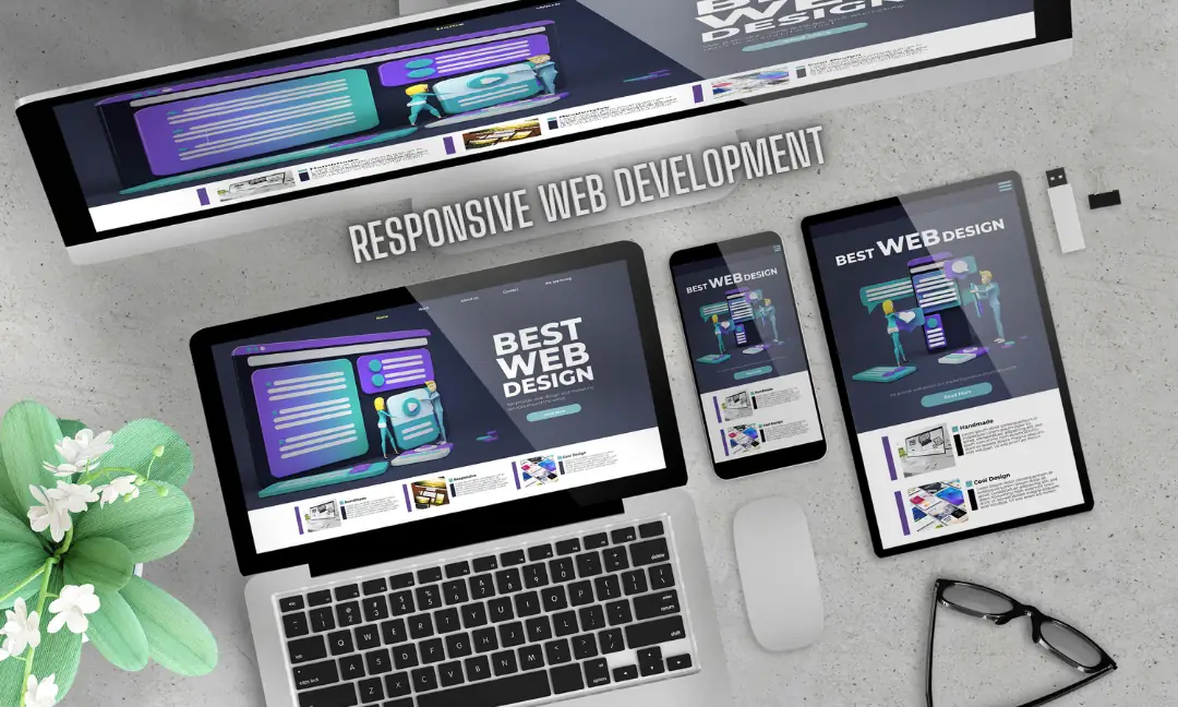
The Design of Your Website Should Be Responsive
Think of your website as an adaptable wardrobe that fits exactly on every device that your users use, be it a smartphone, a laptop, a tablet, or a large-screen desktop. Like a well-fitting suit or a well-fitted outfit, your website should always seamlessly change to match the screen size, guaranteeing that it always looks its best and is comfortable for visitors.
The best part is that this adaptability improves the usability and aesthetic appeal of your website. Moreover, a responsive design also attracts the attention of search engines like Google.
Therefore, adopting a responsive web development design improves the appearance of your website. It also boosts its rating, increasing the number of potential visitors. It's similar to giving your website a makeover that draws more attention from online users and turns heads at the same time.
Keep Your Website’s Design Simple
Think simple when designing a website. A simple website is easy to use on a mobile device. Large, simple-to-click buttons and less text are necessary to give users a smooth experience. Therefore, you should minimize the amount of photos and videos on your website. Moreover, excess images and videos increase the loading time. In the end, it makes your website harder to use on mobile devices.
Improve the Loading Speed of Your Website
People visiting your website through mobile are frequently on the move. These users want your website to load quickly. Therefore, a decrease in search engine rankings and high bounce rates are a result of slow-loading pages. By utilizing caching strategies, decreasing HTTP requests, and lowering picture sizes, you can improve the speed at which your website loads.
Make Your Plugins and Tools Mobile-Friendly
When it comes to making websites work seamlessly on mobile devices, it's like ensuring a comfortable fit for each visitor. Imagine if a website were a pair of shoes: just as you wouldn't expect a size 10 shoe to fit a size 6 foot perfectly, tools and plugins designed for desktop sites might not suit mobile browsing.
Utilizing tools and plugins that are specially designed for mobile devices is crucial for this reason. Consider it as customizing the user experience to each visitor's wants and preferences on your website.
Pop-up windows, video players, and contact forms are examples of features that should be designed with mobile users in mind to make sure they work well. They also help you to improve the browsing experience overall on smaller displays. By giving mobile optimization top priority, you can almost make sure that every visitor to your website, regardless of the device they're using, feels comfortable on your website.
Make Your Website's Content Effective
When it comes to website optimization, content is king. This implies that, especially for mobile visitors, the content on your website should be like a friendly host. Think of your content as a kind host that extends a warm welcome to every guest, irrespective of the gadget they are utilizing.
Well, then, what is involved in this kind of hosting? It all comes down to communicating clearly and succinctly. Rather than overwhelming your visitors with long speeches, divide the content into manageable chunks. Similar to a cordial discussion, no one wants to be inundated with information all at once.
Consider your content as a casual conversation in which you lead your audience using headers and bullet points. It's similar to providing them with road signs so they can easily explore the terrain of your website. Remember that because they frequently want information on the move, mobile customers value this hospitality even more. Therefore, regardless of where a visitor is coming from, let your content be the warm and inviting face of your website, making them feel at home.
Conclusion
Our mobile devices are the focus of our universe. These days, our cell phones are always with us, whether we use them for quick email checks while we're out and about, social media surfing, or even online shopping. Therefore, your website must adapt to this era where mobile is always first.
Think about this: You are using WordPress to establish your online identity. As a result, you are aware of how crucial it is to ensure that your website seems just as well on mobile devices as it does on desktop. It matters more to provide your visitors with a seamless experience than just looking good, regardless of the device they choose.
You can explore WordPress themes and plugins, making sure to choose those that give priority to mobile responsiveness. These tools turn into partners in your mission to create a website that adapts to various screen sizes. This makes it easy for your users to navigate through your website.
However, depending just on plugins and themes is not enough. You preview your website on a range of mobile devices, taking the time to put yourself in your visitor's shoes and make sure everything works and looks great. It is your goal to make your audience feel included and welcome, not irritated by clumsy layouts or long loading times.
Not to be overlooked is the reliable Google Mobile-Friendly Test. This tool is your go-to weapon for checking and fixing potential problems with your website's mobile compatibility. Ultimately, personalizing the online experience is more important than simply checking boxes. It all comes down to knowing your audience's needs, placing yourself in their shoes, and creating an engaging website that sticks in their memory. Adopt a mobile-first approach, and observe how your website grows in the hands of your users.
Author - Sunny J.
Sunny J. is a seasoned content writer with 8 years experience in web development, software development and digital marketing content across multiple formats. He leverages his skills in crafting curated content on the web technology and digital marketing. In his personal time, He enjoys reading article and being up-to-date on trends in marketing and website design.